Don’t Fear New Highs
New highs aren’t a warning sign. They’re part of how the market works.
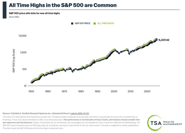
When the press starts talking about the stock market hitting new all-time highs, as they have done recently, it is tempting to believe that we’re due for a correction.
However, when it comes to the stock market, what goes up doesn’t always come down.
Below are a few charts to explain what I’m talking about.
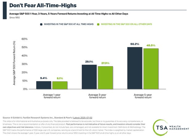
First, in the chart above, the blue bars represent your average 1-, 3-, and 5-year forward returns if you only invested when the market hit a new all-time high. The green bars reflect your returns if you made your initial investment at any other time.
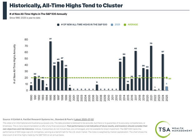
Counterintuitively, rather than being a reason to sell, all-time highs have often signaled continued outperformance in the years ahead, as periods of outperformance tend to cluster.
As noted in the chart above, most years tend to either experience 10 or more all-time highs or none at all.
I’m certain there will be pullbacks in the days, months, and years ahead. And I do not doubt that the headlines will continue to be scary. However, in a world filled with tempting reasons for long-term investors to sell, the stock market hitting a new all-time high shouldn’t be one of them.


When it comes to writing about investments, the disclaimers are important. Past performance is not indicative of future returns, my opinions are not necessarily those of TSA Wealth Management, an SEC-registered investment advisor, and this is not intended to be personalized legal, accounting, or tax advice etc.
For additional disclaimers associated with TSA Wealth Management please visit https://tsawm.com/disclosure or find TSA Wealth Management's Form CRS at https://adviserinfo.sec.gov/firm/summary/323123
IS IT POSSIBLE TO NAVIGATE THESE CHARTS FOR YOUR CLIENTS THAT ARE DAVID & SISSY’S ( OLD ) AGES & WITH NO CHILDREN & NO DESIRE TO LEAVE A PILE ( OR LESS BUCKS ) TO ANYTHING OR ANYONE ++ ?
IF NOT ANY CHARTS , ECT
💥 PLEASE ADVISE YOUR SUGGESTIONS !
many thanks