

Visualizing Asset Class Returns

I often write about the idea that an asset’s perceived risk is primarily a function of which risk an investor chooses to consider. If you only consider the risk of a potentially large drawdown from one day or year to the next, stocks certainly appear riskier than bonds or cash. If you consider the risk of running out of money over the course of a long-term retirement, the risk profile shifts.
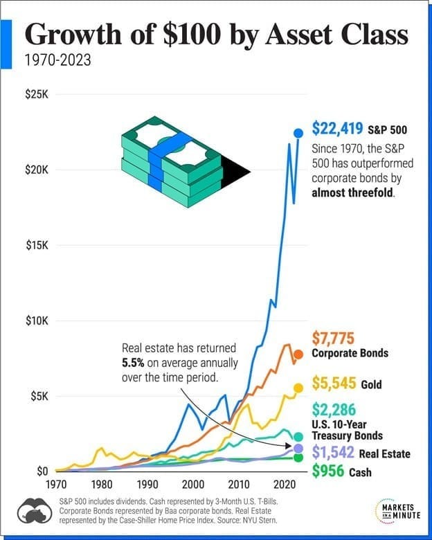
That is where this chart from Visual Capitalist comes in. Here we are looking at a variety of asset class returns from 1970 – 2023. As I mentioned during our last seminar, over this 53-year period, the stock market experienced three instances where it was cut in half and twelve instances where it fell by 19% or more. In any given year the average drawdown of the S&P 500 from some peak to some trough has been around 14%. These things happen and similar setbacks will most likely happen again. But as a long-term investor, what is your goal?
If your goal is to make sure the money you put away is never at risk of being worth nominally less a year from now, by all means allocate to cash. But if your goals are longer term and you are able to stay invested – even when faced with an infinite number of reasons to sell - equities have historically been a better option than bonds, gold, real estate, or cash . . . and it hasn’t been close.
When it comes to writing about investments, the disclaimers are important. Past performance is not indicative of future returns, my opinions are not necessarily those of TSA Wealth Management and this is not intended to be personalized legal, accounting, or tax advice etc.
For additional disclaimers associated with TSA Wealth Management please visit https://tsawm.com/disclosure or find TSA Wealth Management's Form CRS at https://adviserinfo.sec.gov/firm/summary/323123